LIGHT
ARIGHT ICON RAIL
A thin rail of 11 icons down the right edge. The one you are on is yellow and joins the panel. The panel’s title (KILLS · SMG · 3 OF 6 ON) says where you are. It takes the least room, but you have to learn the icons.
1 shows TODAY’s Customize screen next to 4 sidebar layouts. 2 lists every text that can still show in a match, each with our suggestion already picked: REMOVE, SMALLER (80 %) or KEEP. Change any row you like. The phone screen there shows the busiest second, before and after your picks. Then SEND at the bottom.
Our lead for note 1 (C): the tabs as a sidebar on the right, an icon and a word each. Only the weapon chips stay across the top, so there is one row of chips, never two.
Today the 11 tabs run across the top: KILLS, GLOATS, COLOUR, HAT, FACE, AURA, BODY, TRAIL, WEAPON, EMOTES, DANCE. Only 4 or 5 fit before the row scrolls. On KILLS and WEAPON, a second row of weapon chips sits right under it, chips on chips. Every version below moves the tabs out of that row. The weapon chips are then the only row on top, and the panel says which tab you are on.
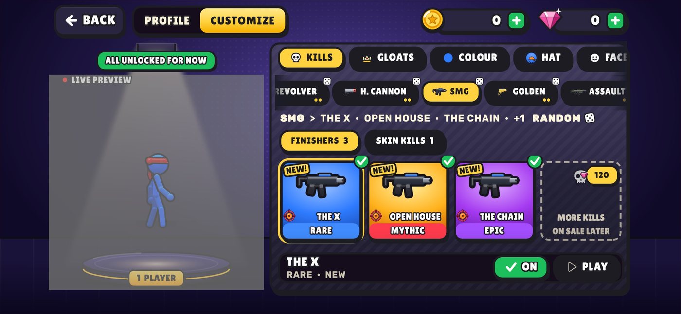
A thin rail of 11 icons down the right edge. The one you are on is yellow and joins the panel. The panel’s title (KILLS · SMG · 3 OF 6 ON) says where you are. It takes the least room, but you have to learn the icons.
An icon and a word for each tab, down the left, between the screen’s edge and your fighter. Reads top to bottom like a menu. Your fighter’s stage gets narrower and moves to the middle.
What you asked for: the tabs down the right, an icon and a word each, in three groups (KILLS GLOATS · the look · EMOTES DANCE) split by thin lines. All 11 fit without scrolling. Your fighter keeps the left, the panel keeps the middle, and its one chip row is the weapons.
A's icon rail with a ≡ button on top. Tap it and the rail opens over the panel with the words (right), then closes when you pick. It is the most compact, but it is one more tap and one more thing that moves.
Checked again on today’s game (v4 a3399de7f) on phone screens: real bot matches on an iPhone 16 shape and a 20:9 Android shape. Of the 47 texts on the old list, 44 are still in the game (25 of them on the real screens below, 19 only in today’s code) and 3 are gone. 11 are new (yellow border), so there are 55 rows. Your accepted picks (on the 44 old rows: REMOVE 12, SMALLER 13, KEEP 19) are kept as they were; each new row has our recommendation already set (no pick needed). Change any row you like. The phone screen there shows the busiest second, before and after your picks. Then SEND at the bottom.
Our lead for note 1 (C): the tabs as a sidebar on the right, an icon and a word each. Only the weapon chips stay across the top, so there is one row of chips, never two.
Today the 11 tabs run across the top: KILLS, GLOATS, COLOUR, HAT, FACE, AURA, BODY, TRAIL, WEAPON, EMOTES, DANCE. Only 4 or 5 fit before the row scrolls. On KILLS and WEAPON, a second row of weapon chips sits right under it, chips on chips. Every version below moves the tabs out of that row. The weapon chips are then the only row on top, and the panel says which tab you are on.
A thin rail of 11 icons down the right edge. The one you are on is yellow and joins the panel. The panel’s title (KILLS · SMG · 3 OF 6 ON) says where you are. It takes the least room, but you have to learn the icons.
An icon and a word for each tab, down the left, between the screen’s edge and your fighter. Reads top to bottom like a menu. Your fighter’s stage gets narrower and moves to the middle.
What you asked for: the tabs down the right, an icon and a word each, in three groups (KILLS GLOATS · the look · EMOTES DANCE) split by thin lines. All 11 fit without scrolling. Your fighter keeps the left, the panel keeps the middle, and its one chip row is the weapons.
A's icon rail with a ≡ button on top. Tap it and the rail opens over the panel with the words (right), then closes when you pick. It is the most compact, but it is one more tap and one more thing that moves.
Checked again on today’s game (v4 a3399de7f) on phone screens: real bot matches on an iPhone 16 shape and a 20:9 Android shape. Of the old list, 0 texts are on those real screens, the rest are still in today’s code, 3 are gone, and 11 are new (yellow border). 54 rows now. Your picks (REMOVE 14 / SMALLER 14 / KEEP 19 on the old rows) are kept; each new row has our recommendation set. Change any row you like.
REAL SCREENS, TODAY’S GAME. 18 captures of v4 a3399de7f (5 Nov), from real bot matches (you + 3 bots, FFA) on the build lab, on an iPhone 16 landscape shape (2556x1179) and a 20:9 Android shape (2400x1080), on 3 arenas (Backyard, Spike Castle, Dusty Saloon). They are software-rendered, so colours and blur differ a little from a phone. The in-game text rules from 3 Nov are on in all of them. 2v2 team bot matches have no capture route in the lab, so team-only texts (team intro, MATCH POINT: BLUE) are marked as “in today’s code”. Tap any picture to open it big.
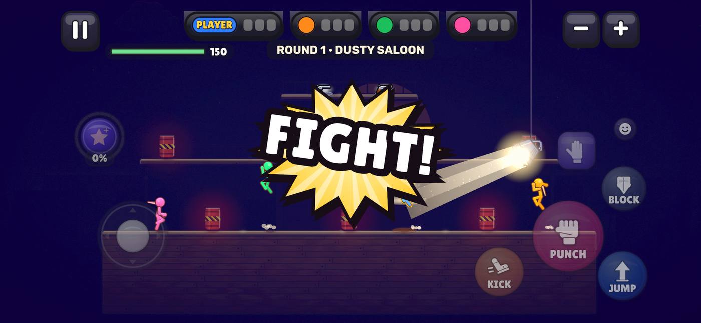
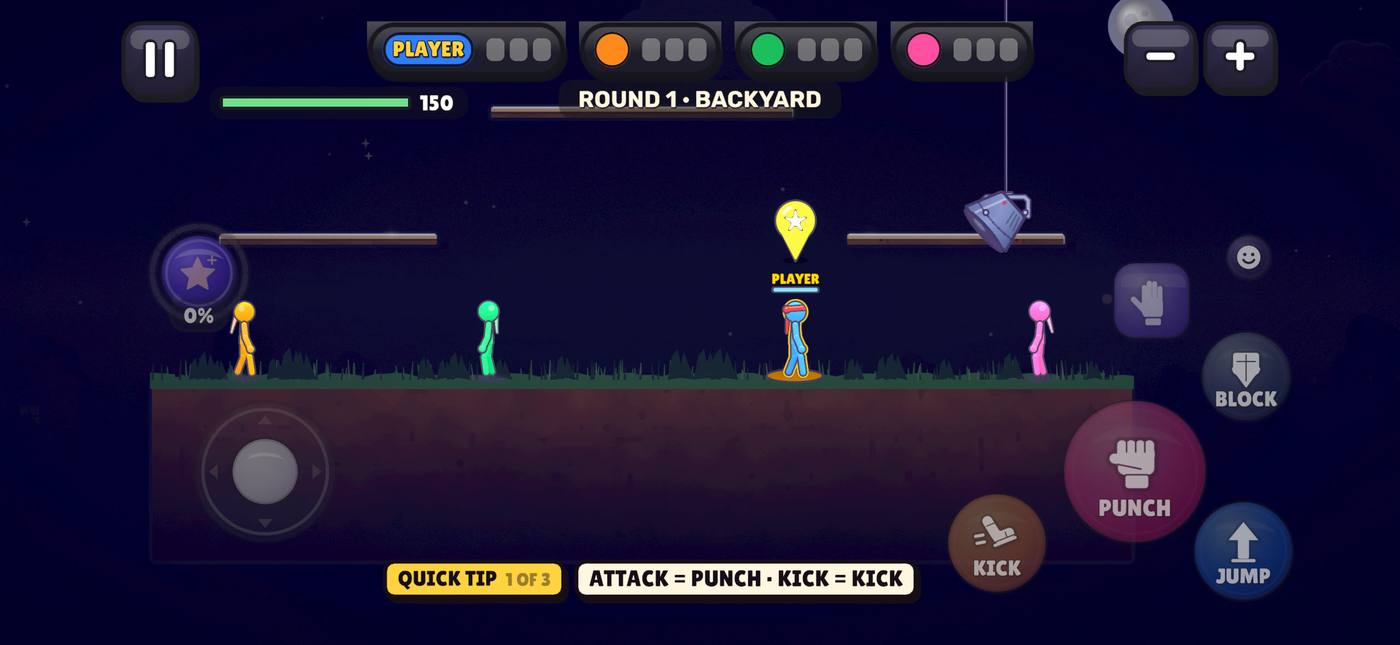
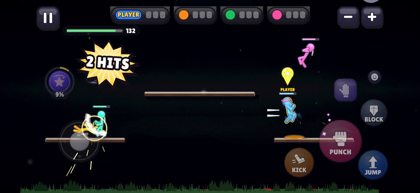
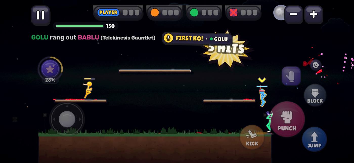
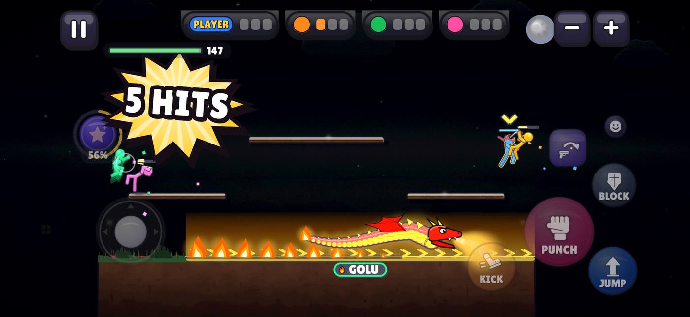
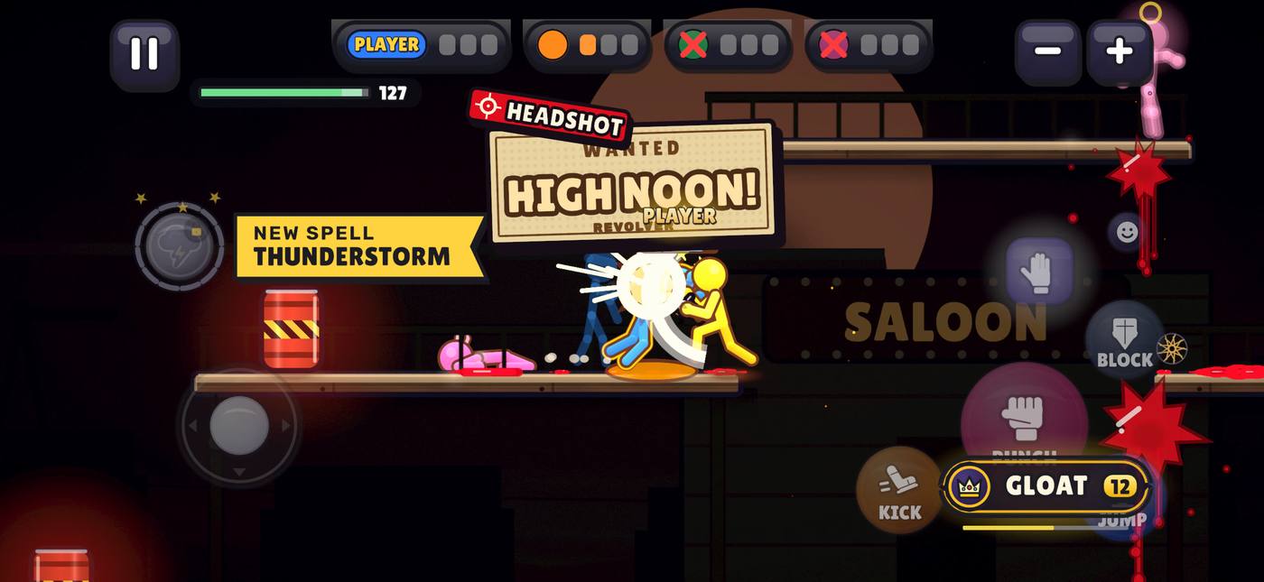
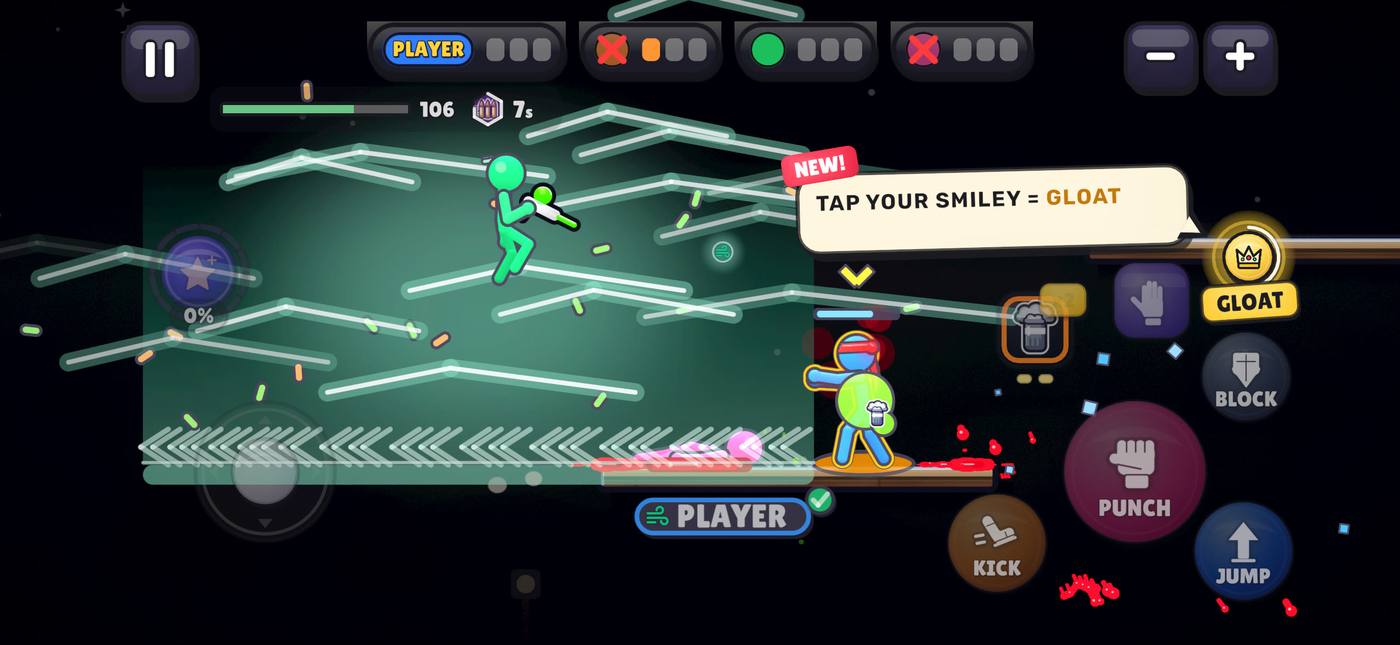
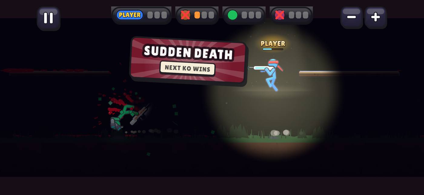
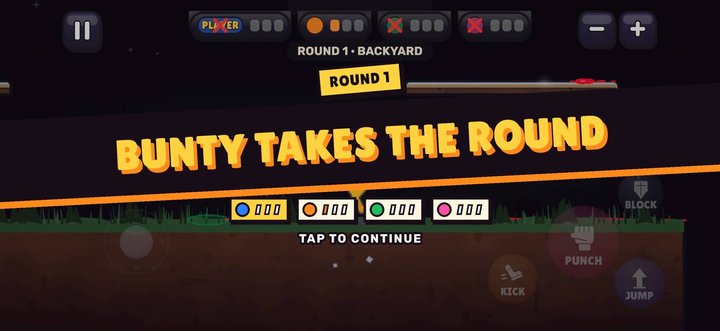
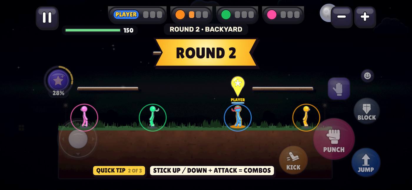
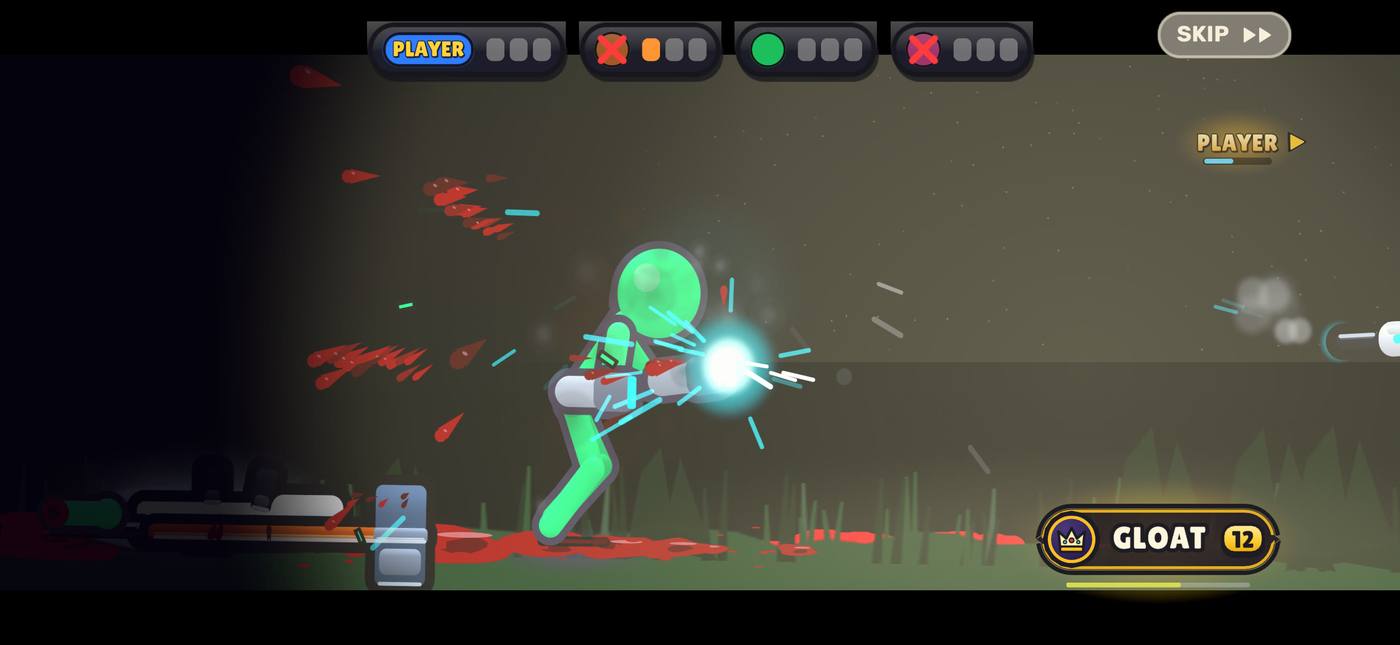
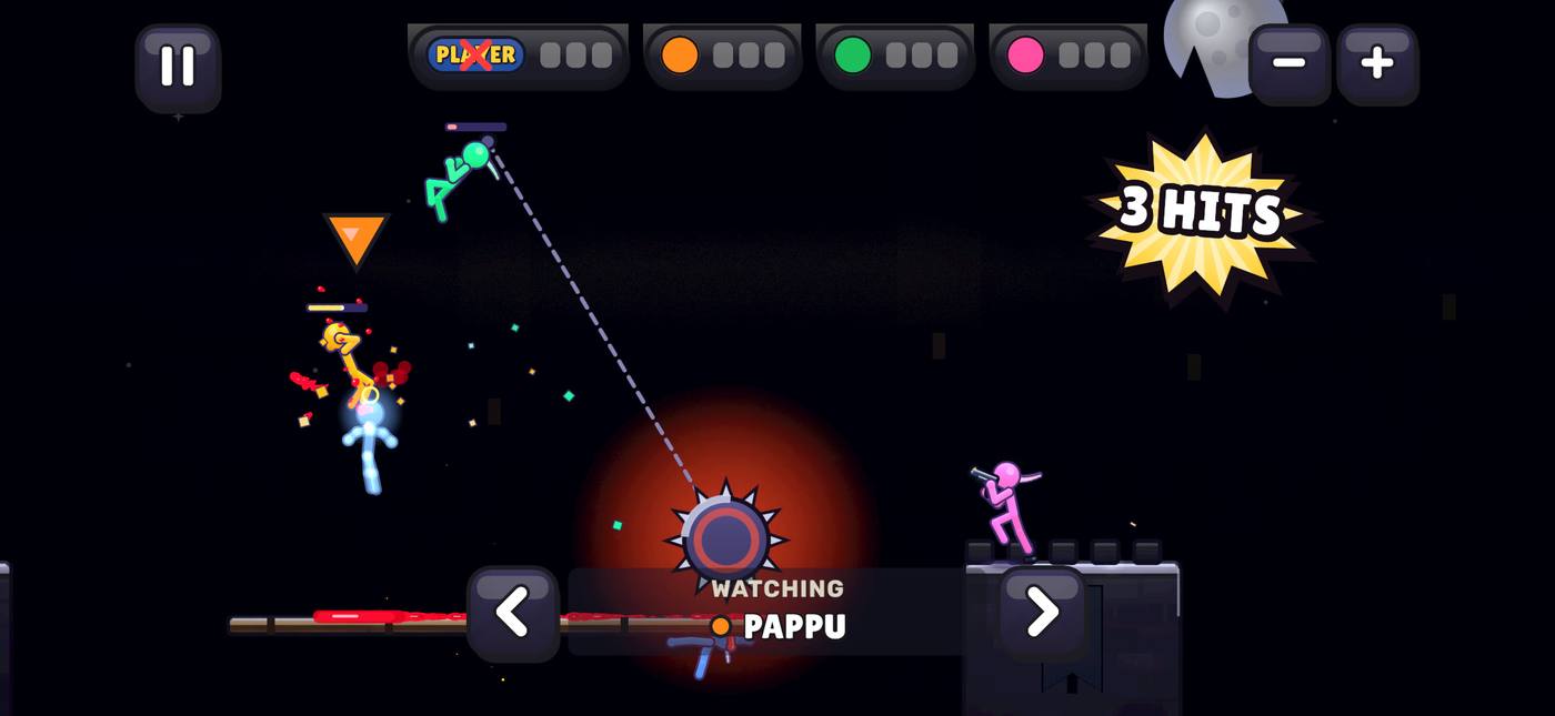
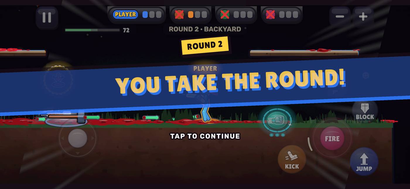
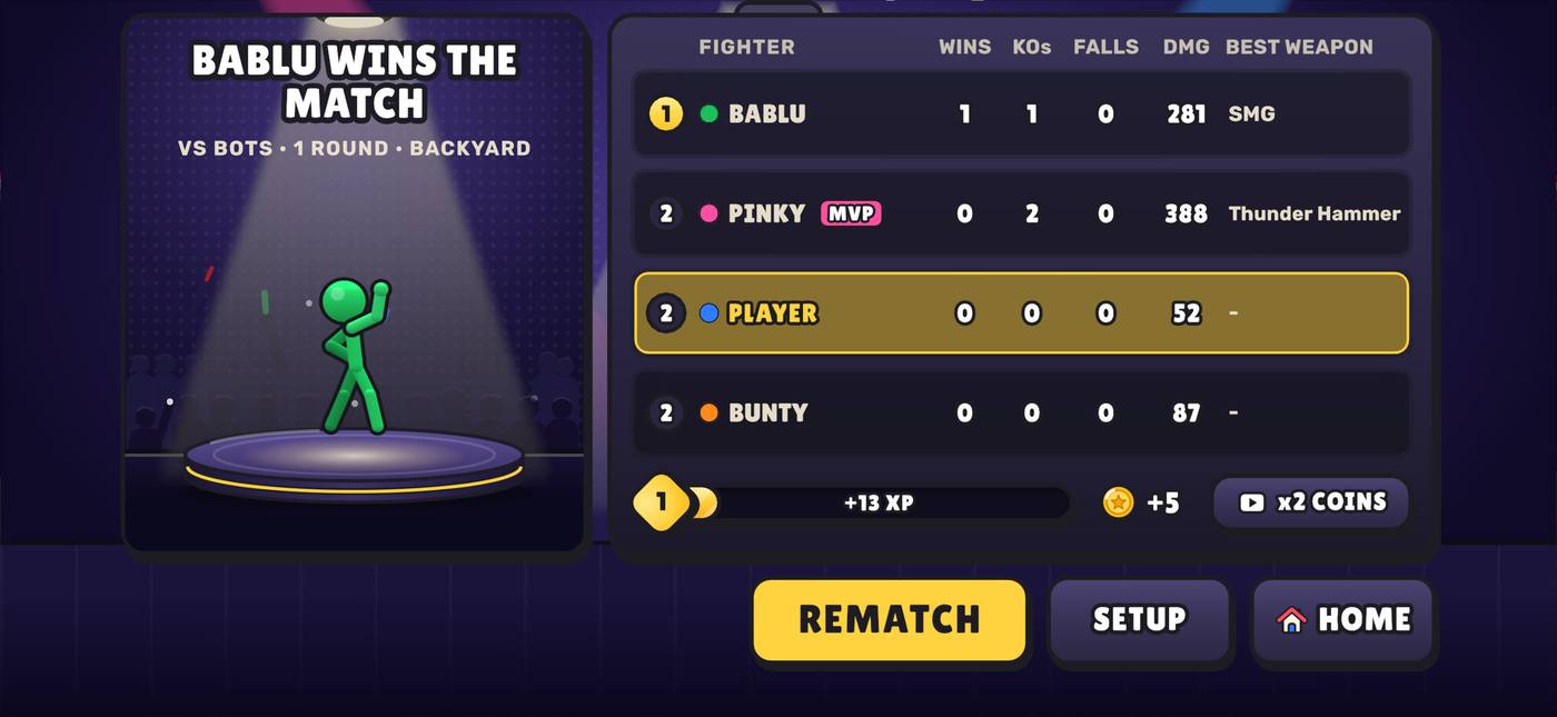
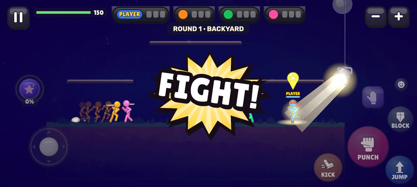
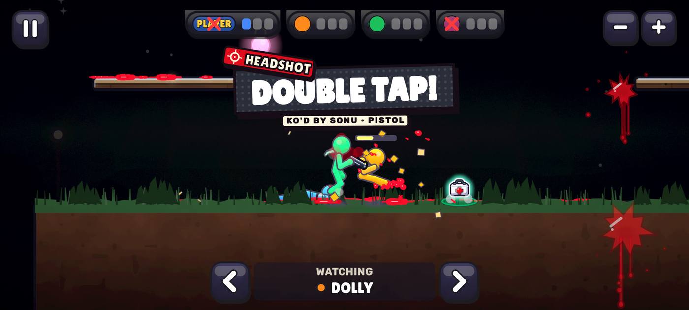
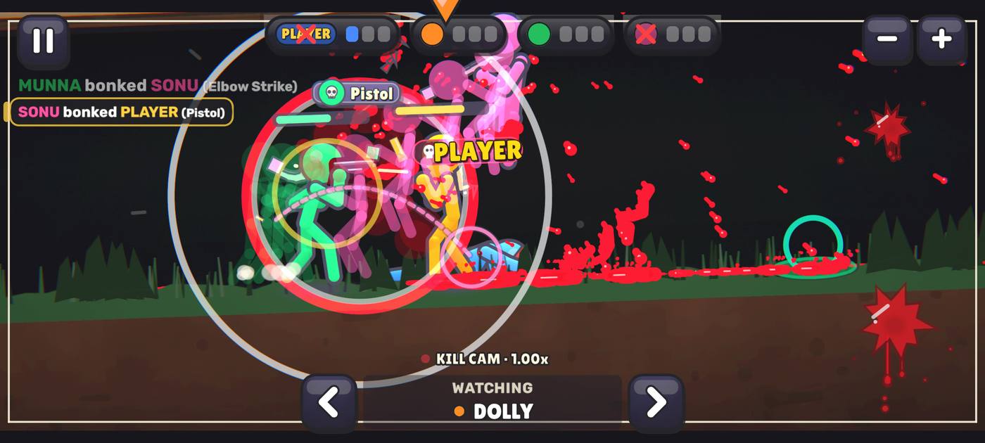
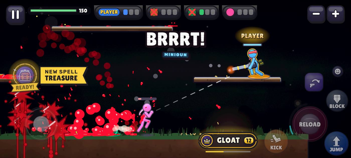
Same real screen. Dashed red = REMOVED (blanked out); dashed blue = SMALLER (80 %). The game would not draw the removed texts at all.
Pick the sidebar above or here (our lean is marked ★). The texts are already set to our suggestions; change any row in the list. Then SEND. It goes to the inbox as one message (LIVE, topic UI picks). Your picks stay saved on this device.
Enter your inbox key once on this device. It stays in this browser only (the board and the pages share it).
Page 91 · 5 Nov · lane COSMVAR, concept only (no game code changed). Tabs come from UI/V4/Profile/CustomizePage.cs + Meta/Wardrobe.cs (live-userbuild-05nov / v4 c1648792f). Screens are drawn at 998 game units wide in page 88’s game parts; the kill posters are the gate captures’ frames. The texts come from Core/TextBudget.cs (the 3 Nov LESS TEXT rules) and every HUD file that writes in a match (HUD*.cs, Hud*.cs, MomentsUI, KillPlate, SpellBanner, StunChip, UltimateUI, OnlineInMatch, World.Popup’s small words). The screens and crops in the texts section are real captures of v4 a3399de7f (5 Nov), in img/91/live/.