FEEDBACK 20 OCT · 4 DECISIONS · 12 CONCEPTS
YOUR THUMBS,
OUT OF THE WAY
Every concept here is drawn in the game's own art, on the real arena, at the real button sizes. They're live, so tap the buttons, play the throws and drag the wipes. Pick one concept per section (framing concepts combine).
1Tap buttons on the phones: they press2Flip states, play pickups, scrub the throws3PICK THIS on the ones you like4COPY MY PICKS, paste in chat
1
THE LAYOUT
"proper size and alignment and symmetry for default control layout, in such a way that works better (think every possibility)"YOU, 19 OCT
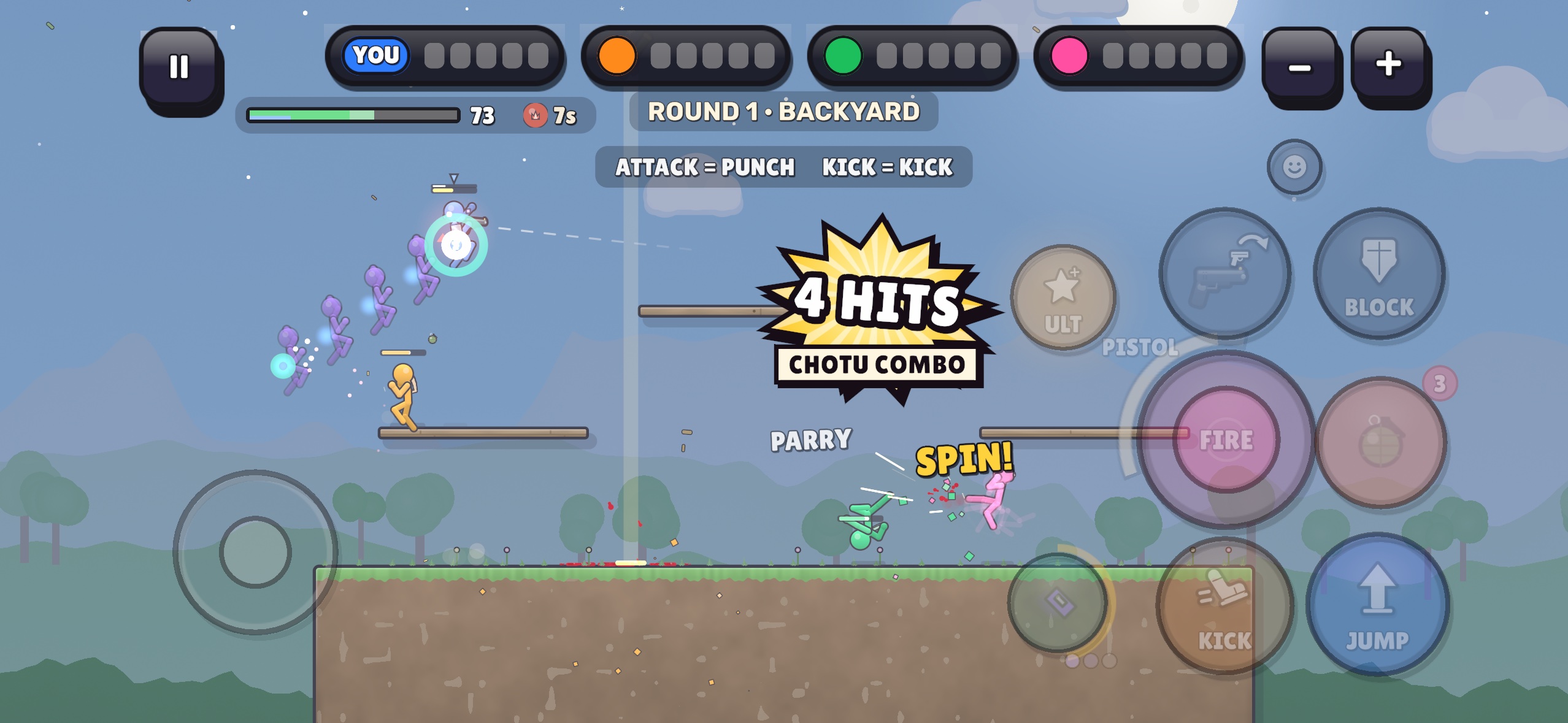
- 10 circles in 7 sizes. Nothing lines up, and FIRE overlaps ITEM.
- 25% opacity. You can't read them mid-fight.
- A big slice of the screen sits under buttons (the number is under each phone below), almost all of it on the right where the fights happen.
- No symmetry. The move stick sits lower and nearer the edge than FIRE.
- The GESTURE scheme goes. Twin-stick is the only layout, so it has to be great.
SHOW ON
ON ANY LAYOUT, ALSO
- iPad: buttons keep their phone size in cm (62% of the screen-relative size), so far more of the arena shows.
- Notch + home bar: every button stays inside the safe area on 20:9. 16:9 phones have no notch.
- BUTTON SIZE and EDIT LAYOUT in Settings still work on top of whichever you pick.
2
SKY POWER + GEAR
"the sky powers up, and gear triggering buttons are so bad ui"YOU, 19 OCT
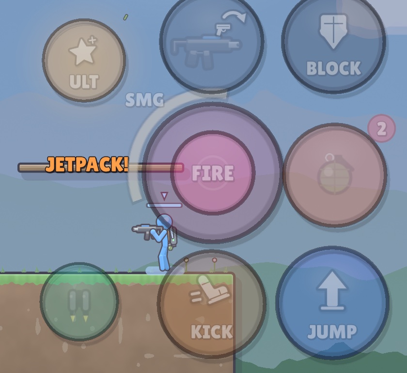
- ULT is a plain star. You can't tell WHICH sky power you hold.
- Gear is a small dim circle with a tiny icon.
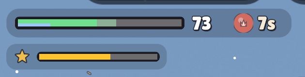
- Charge lives in a thin bar in the top-left HUD, far from the button.
- Nothing says READY. You have to go looking.
SHOW ALL THREE IN
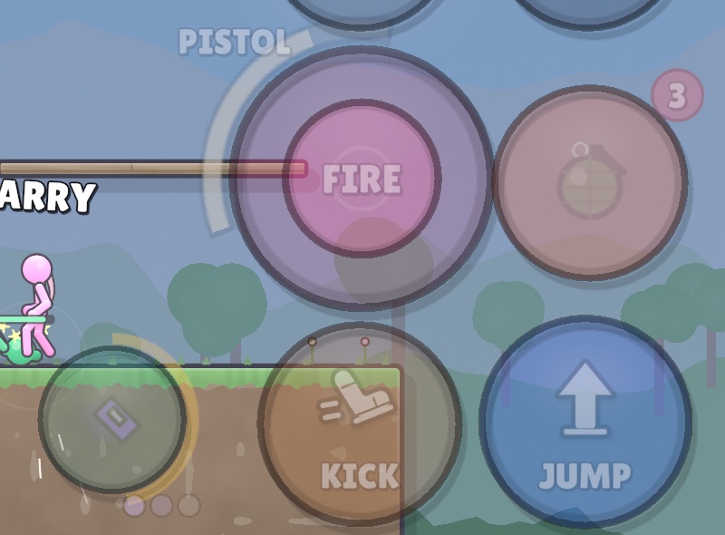
- Bigger and named: in all three the buttons grow and carry the power's own picture instead of a star.
- The charge moves onto the button. The thin meter in the top-left HUD goes away.
- Every sky power and gear gets its own art. Rocket Rain and Jetpack are the samples here.
3
THE THROW
"Bombthrow ui should be much simpler"YOU, 19 OCT
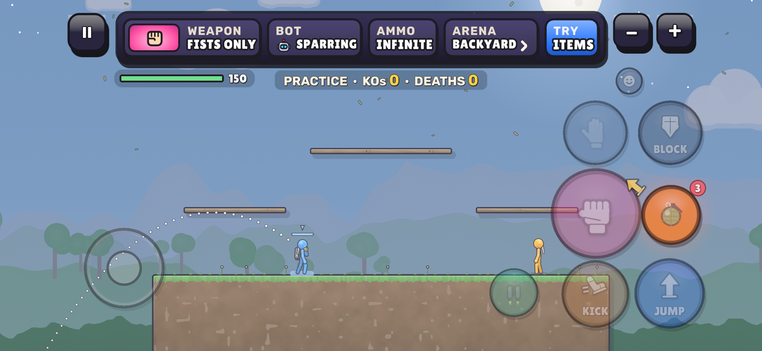
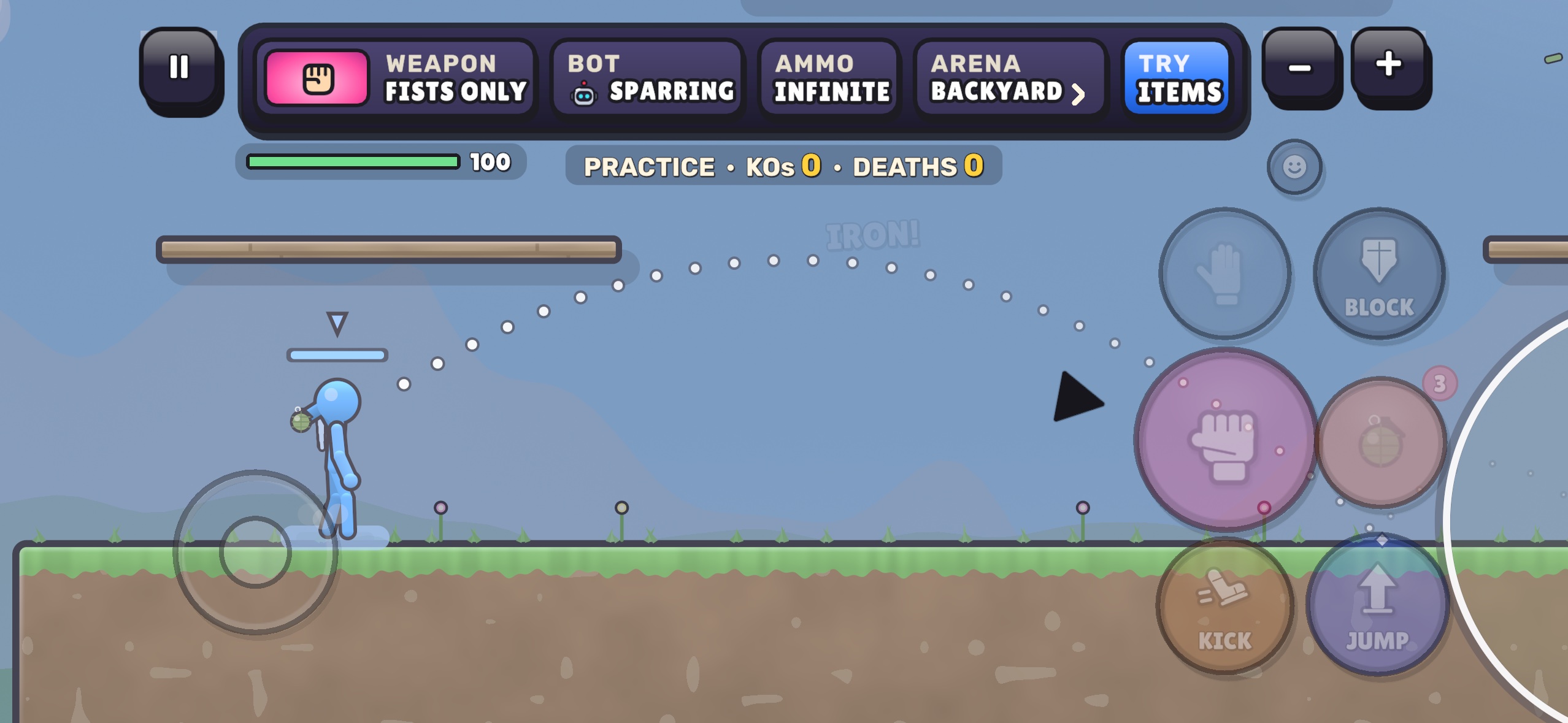
- Drag from the ITEM button: a yellow arrow sits on the button itself.
- The dotted arc runs off-screen, so you can't see where it lands.
- Aiming backwards from a button works like nothing else in the game.
4
FIGHT IN THE CLEAR
"make our map in such a way that the players almost always are around the area that is not covered by buttons (i need to see visual how it be like before implementing)"YOU, 19 OCT
- The main floor runs under FIRE, KICK and JUMP on the right.
- The camera frames the whole arena, not the part you can actually see.
- Fights drift to the right edge, exactly where your right thumb is.
- These combine. Pick more than one here: SAFE FRAME for every map now, plus THUMB-PROOF ARENAS for new and reworked maps, is my pick.
- Two thumbs on the glass hide more than the buttons: turn THUMBS on above to see it.